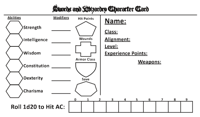
 I was lazy with the 3" x 5" index card sized S&W player character sheet I'd made last week, so I decided to do it over again, using the LL sheet as a template. I'm not quite as happy with it (seems a little heavy on the left side) but it'll suffice. I purposely left this one titled "Character Card" as it might be more useful for some folks to just use it for NPCs rather than their PCs, given its size, and because it's more of a "card" than a sheet. You can get it here.
Wednesday, May 27, 2009
Swords & Wizardry PC Sheet Do-Over
 I was lazy with the 3" x 5" index card sized S&W player character sheet I'd made last week, so I decided to do it over again, using the LL sheet as a template. I'm not quite as happy with it (seems a little heavy on the left side) but it'll suffice. I purposely left this one titled "Character Card" as it might be more useful for some folks to just use it for NPCs rather than their PCs, given its size, and because it's more of a "card" than a sheet. You can get it here.
Labels:
Index Card
Subscribe to:
Post Comments (Atom)


10 comments:
Now that is an excellent card. I would start players off with something like this to see if they made it far enough along to require an actual character sheet. Well done.
I agree. The heading font doesn't come through in PDF, probably because it is not a common M$ font but it has all the basics.
Looks like this won't look right for folks without the right font installed - you need the Blackletter_HPLHS font. I got it here: http://www.urbanfonts.com/fonts/Blackletter_HPLHS.htm (for the LL sheet btw, you need the Outlaw font, which is possibly why it looks so murky to you ancientvaults). The rest of it uses Calibri.
Hmmm, I have that faunt, and I re-installed it, and I still see the same S&W sheet.
I think you're seeing the S&W fine, wasn't it the LL one that seemed murky? That one needs the Outlaw font installed.
I have them both and I can see the LL one just fine, but the S&W seems to have a different header font. Still, I am not complaining, I can change the header font myself and the rest of the sheet looks spiffy.
Weird. Mac vs. PC thing? Glad you can still make use of it! I actually blew the LL one up 121% and printed it out onto a 4x6 index card without it going over the margins. There's a lot of wasted space at the edges, but it actually still looks pretty good without real modification. Feels more comfortable to write on too. I left out "Alignment"! Doesn't matter too much, but I'll fix that up at some point. Just means a little more crowded in the upper right area. Or should I not bother?
Could be Mac vs PC. On the S&W sheet I see this weird 3D-like 80's looking font. Not the end of the world and I really don't want to sound like a critic or a downer, I do like the sheets a lot. I use alignment, but I could probably just slip it in on the sheet. I am not sure how many people actually define alignment anymore.
It's cool, I actually really appreciate the feedback and wish I could figure out what the deal is - Might have been better to insert an image of the font in the header, rather than the font itself! I was concerned about quality loss though.
I mostly hate alignment and have thought more than once about how to completely replace it in the games I play, either by a new mythos/system of deities or some other way, but the mechanics seem to demand it at least to some extent.
You could probably ask on the S&W messageboard for a high resolution graphic header for a character sheet, I am sure that there are some made up.
Post a Comment